

What company wouldn’t want to help customers embrace their ability to self-serve? Most customers want to be able to help themselves. You could have the best self-service information available, but it’s not very useful if your customers can’t find it. From the words of Top Chef, plating and presentation is everything.
Design and user experience aren’t just buzzwords—they matter when it comes to serving your customers knowledge. The way your customers interact with your brand is an impression of your company and the service you provide. If customers have a tough time navigating your site, they’re going to feel frustrated with your brand. People like pretty, easy to navigate things, so plate your website as cleanly as beautifully as possible, and serve up some knowledge.
Here are three of our favorite knowledge management examples:
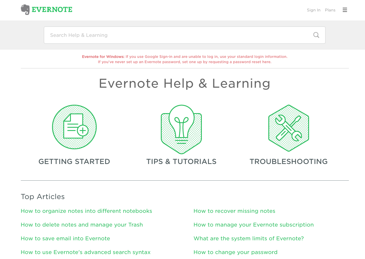
1. Evernote
Evernote made our top knowledge management list because they keep things beautifully simple. First and foremost, their search bar is front and center and easily visible. Customers want to be able to easily search a specific issue they have, rather than combing through a maze of endless articles. Evernote’s help center also has a list of top articles, as well as a clearly marked way to get more help if needed.

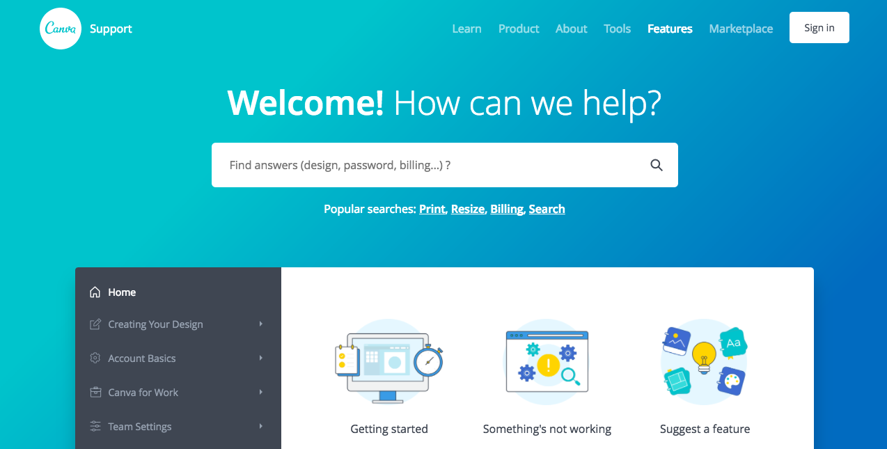
2. Canva
Canva’s knowledge base makes it easy to access the basics on getting started, or when something isn’t working. However, they also offer something unique—they allow customers to suggest features. Canva understands that customers interact with their product and website the most and are a wealth of information when it comes to what Canva can improve on.
By giving customers a voice, Canva gains a valuable opportunity to learn from their customers and improve their business as a whole. Not only that, Canva has a thorough sidebar of information with simple titles and well-designed organization methods centered around creating designs, account basics, and using Canva for work.
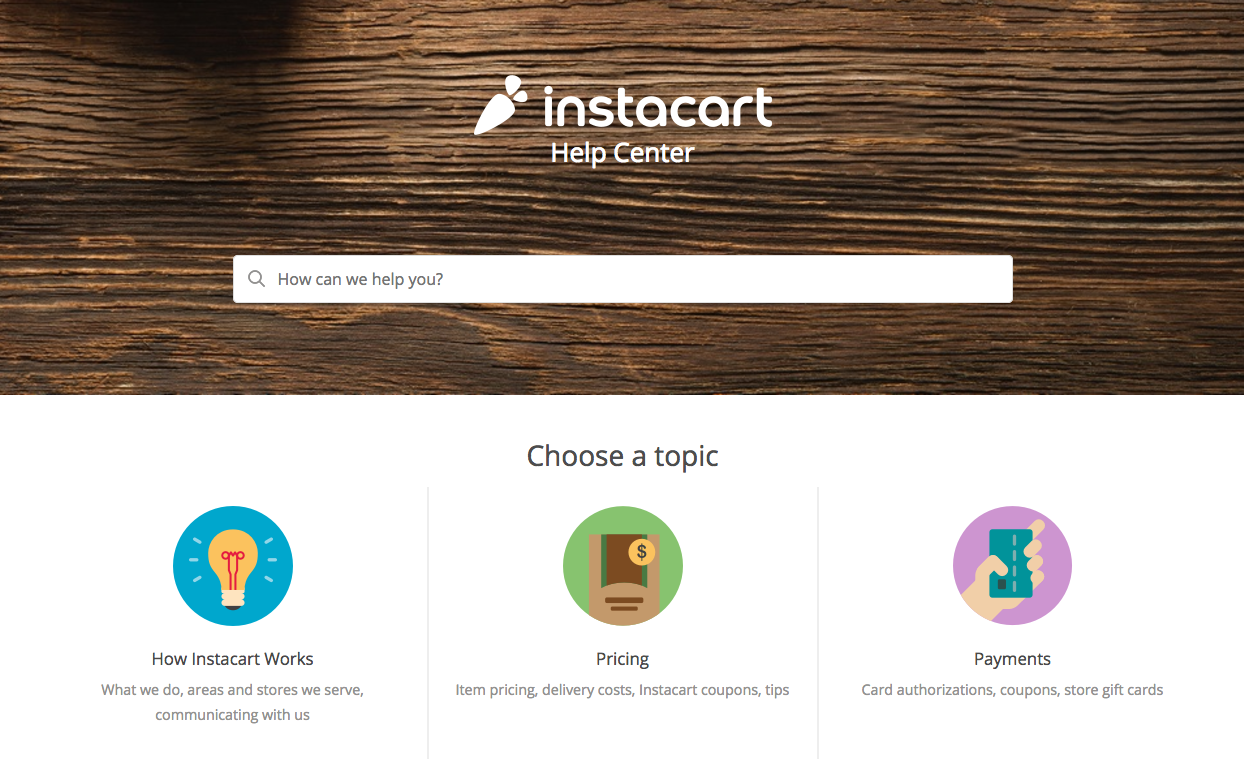
3. Instacart
Instacart made our top knowledge management examples because of its utter simplicity. They host a prominent search bar and clean graphics on common customer questions, such as how Instacart works, how much it costs, and the ins and outs of ordering and delivery through Instacart. Instacart’s help center consists of crisp and clean content categories, making it easy for self-sufficient customers to find answers.
Presentation is key
All three knowledge management examples have a few knowledge base design best practices in common, including an easily accessible search bar, short and simple article titles, and a clear way to get more help if needed. When customers are able to self-serve, your company reaps the rewards. Gartner reports that organizations with proper knowledge management in place can reduce overall support costs by 25 percent. What’s more, 94% of Zendesk Guide users reduced support costs by 50% or more.
Navigating an unfamiliar website can be daunting, but presenting your knowledge base in a simple, beautiful manner can make your customers’ lives easier—especially if they’re already seeking help. A complicated help center is only another barrier for a customer to find answers, so remember: keep it simple.
Also Find: